Anatomy of the Histogram
» Posted on June 22 2009 in Histograms
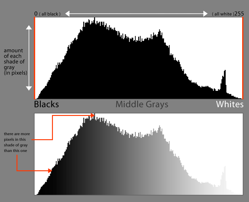
The histogram. It seems a little daunting at first, but it’s really quite simple, and extremely useful. The easy explanation: The histogram (as seen below) is simply a bar graph that represents the amount of each shade of gray in an image, with black represented on the left, and white on the right, and each small bar representing one shade of gray.
The idea, is that by glancing at your histogram, you can tell if your image is overexposed - all the bars shifted to the right, meaning blown out highlights, or underexposed - all the bars shifted to the left, details lost in the shadows.
Typically you want to have a histogram with no clipping, clipping being any black or white values that are full black, RGB=0,0,0, or full white, RGB=255,255,255, and represented by the graph being cut off on either the left or right side. When clipping occurs, you lose detail in the shadows and/or highlights.
Your histogram can also tell you about the contrast in your image. An image with low contrast will have all the bars in the graph(histogram) squished into the center, meaning most of the values in your image are in the middle gray zone with no darks or lights. It’s often said that you should have a nice “mountain” shape in your histogram, representing a broad, full tonal range. Of course, the actual shape doesn’t really matter at all, as long as you’ve got a good tonal range with no clipping (unless you meant to!).
Now, with all that being said, there are exceptions and different variables to take into consideration, like moody lighting conditions and high and low contrast images for artsake. And what about histograms that show red, green and blue? Another thing to remember is while editing your image in a program like Photoshop, crop your image to your liking before reading your histogram. You might have cropped out the clipped highlights or shadows.
Remember in the first paragraph when I said that this was the “easy” explanation? We’ll look at several different factors to take into consideration and just about everything you need to know to become acquainted with the histogram.
 |
 |
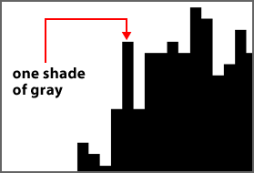 |
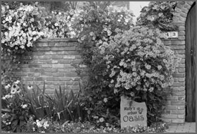
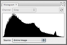
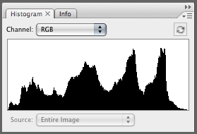
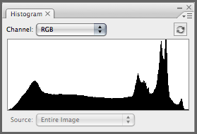
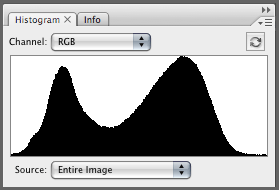
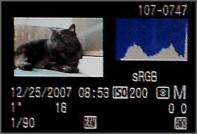
| The black and white image represented by the example histogram (shown right). | A standard histogram (this one from Photoshop CS3). Notice the nice "mountain" shape. No blacks or whites are clipping and there is a nice, broad tonal range. | Close up of the individual bars that represent one single shade of gray. |
 |
||
The histogram palette in Photoshop will tell you the specific number of pixels in a specific tone.
 |
|
|
| Here I've highlighted a single shade of gray in the bar graph (the vertical red line). I've also highlighted in red the value of that shade, 42; remember, there are 256 shades from black (0) to white (255), and the pixel count for that shade, 112,860. | The red pixels in this image represent the approximate area covered by gray pixels with an RGB value of 42,42,42. | You probably won't be using the histogram to isolate individual shades of gray, but it's nice to know the inner workings of the histogram and what the histogram palette in Photoshop can actually tell you. |
Common Uses
Now on to the common use for the histogram; determining exposure. A histogram for a color image that displays RGB values basically represents a composite of the Red, Green and Blue channels. The red, green and blue values all have approximately the same values as their grayscale counterparts. What that means is that you can still get a good idea of where your exposure is in your color images by looking at the histogram. If the values in the graph are squished to left with virtually no mids or highlights, then it’s a fair assumption to say that the image is underexposed. If all the values in the graph reside on the right side with little or no shadow values, the image is probably overexposed. Of course, I mentioned earlier that there are exceptions, but we’ll get to those later. For now, let’s take a very general look at using the histogram to determine exposure.
 |
 |
 |
 |
 |
 |
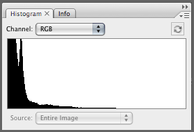
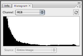
| A healthy histogram. It's got a good tonal range tapering off into black and white without clipping the shadows or highlights. | A pretty unhealthy histogram. Most of the values are pushed to the left in the shadows where some major clipping is going on. There are no middle gray or lighter values. Solid black in the shadows means no shadow detail. This is typically what an underexposed histogram will look like. | Another unhealthy histogram. The values in this one are pushed into the lighter tones with clipping in the highlights ( see that black line being cut off the right side?). Solid white means no detail in the highlights. This is a good example of a histogram representing an overexposed image. |
Now lets take a look at some of those exceptions and oddball cases I mentioned earlier.
 |
 |
 |
 |
 |
 |
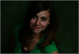
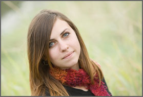
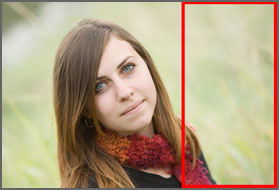
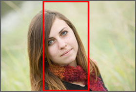
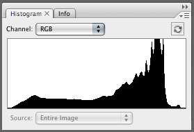
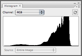
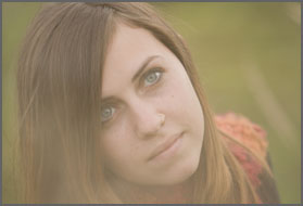
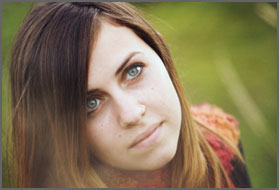
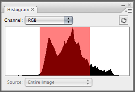
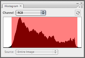
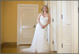
| At first glance, this histogram may look somewhat overexposed, when in reality, the subject (the girl in this case) is perfectly exposed. In this image the subject is against a bright, plain background which is throwing off the histogram. | In Photoshop, I've created a selection around a portion of the image on the right. Notice the histogram largely resembles that of the image to the left. That's because most of the values in this image are in the mid to lighter range. But those aren't the important values. | Here I've created a selection around the subject and included some background as well. Notice how the histogram is drastically different. This graph shows a much better exposure and tonal range. |
The thing to remember about histograms, whether they’re being viewed in camera, or in Photoshop, is that they represent the entire image. It may be necessary to check your histogram in Photoshop by making a selection around the subject, with some of the background in the selection as well. The histogram will change to reflect the inside of that selection. It might also be necessary to underexpose a little to bring out some detail in bright backgrounds. But if you’re going to lose shadow detail in your subject, you’ll probably need to sacrifice background detail for a properly exposed subject. Bracketing is a good way to ensure a proper exposure if you’re unsure about an image in difficult lighting situations.
Let’s take a look at an image with the opposite situation.
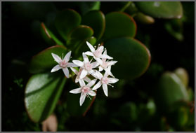 |
 |
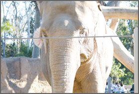
In situations like this, the histogram can pretty much only tell you whether you've clipped the highlights or not. In this case none of my highlights are clipping and the flower (the subject) is nicely exposed. It doesn't matter that a large part of the background detail is lost in the solid black, clipped shadows because the white flowers are the focus of the image. |
Contrast and the Histogram
The histogram can also tell you a bit about the contrast in an image. An image with little to no contrast will often contain values in the middle of the histogram. The graph will usually display a very thin band of tones.
 |
 |
 |
 |
|
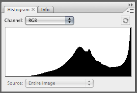
Here we have an image shot in failing daylight and through some brush. Notice how the tonal range is very small and located mostly in the middle. There are very few darker gray values or lighter gray values, and no white or black at all. This is usually what a low contrast image's histogram looks like. |
Here's the same image after some adjustments in Photoshop. Notice how the tonal range in the histogram (highlighted in red) is much longer than the squished histogram to the left, and the contrast is vastly improved. The graph spans most of the chart, from the dark grays and black to the light grays and off into white. |
It’s also possible to partition areas of differing contrast in an image to gauge the overall contrast by looking at the different histograms that make up the final composite.
 |
 |
 |
 |
 |
 |
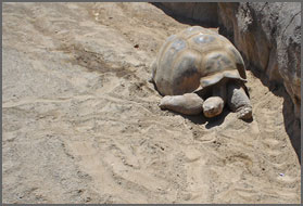
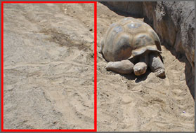
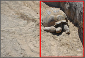
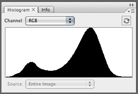
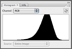
| This is the histogram for the entire image of this tortoise and it's sandy surroundings. At a glance, the histogram may look like it reflects an image with little contrast. But if we section off different areas of this image, we begin to see what histogram shapes make up the graph you see above. | The area partitioned in the above image is filled with grayish dirt that has no darks or lights. The graph shows a thin band of tones in the middle which tapers off well before any darker or lighter tones. | The section partitioned above shows a much better representation of the contrast in this image. There are three major tonal regions, the dirt represented by the "hump" in the graph on the right side, the darker regions of the rock and tortoise shell represented by the tones located in the "dip" in the middle and the dark shadows represented by the hump on the left. |
The histogram that represents the entire image of the tortoise is a composite of the two histograms that come from partitioning the image into it’s two major tonal distributions, the large sandy area and the much more contrasty tortoise side.
Different Types of Histograms
You’re not limited to just one histogram. Most photo editing programs will have a histogram feature with several viewing options. Your camera may have a live histogram, which shows you a histogram of the shot before you shoot, or a histogram view while previewing your images on the magic LCD screen on the back of your camera.
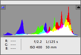
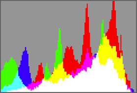
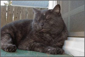 |
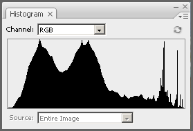
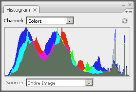
For this image I've included three different versions of a histogram. Note that in the first two, the image was cropped. | |
 |
 |
 |
| Standard RGB view for the histogram. It shows a composite of the red, green and blue channels. The RGB values have a tonal value roughly equivalent to their respective shades of gray. What you get is a fairly accurate representation of the overall tonal quality of your image. The RGB view is probably the most common histogram used. | This histogram has the primary and secondary colors overlayed on the graph. When viewing the histogram with a color overlay, the saturation of the color is displayed from no saturation on the left to full saturation on the right (clipped colors). | An in camera view of the histogram while in preview mode. Notice the whites clipping on the right. For this image it was more important to capture the detail in the dark fur than to capture the small amount of detail in the sky. |
You’ll often see a luminosity histogram as well as Gray, RGB and color histograms. Luminosity histograms show the brightness distrobution in an image (they’re sometimes referred to as “brightness” histograms). They can give you a greater representation of the visual brightness and contrast in your image than the RGB histogram can because they take into account the fact that the human eye is more sensitive to green light, and they compensate for that fact.
The Histogram In Adobe Camera RAW
 |
 |
 |
| Pretend this image is open in ACR. The histogram in the upper right corner (pictured to the right) represents the tonal range of this image. | As you may have noticed, the ACR histogram shows the Red, Green and Blue channels. It's important to note that the histogram in ACR is much more accurate than the one found in your camera, so it will look a little different. | The red in the graph represents red tones while the blue represents blue tones and green represents green tones. Cyan represents tones in the blue and green channels, yellow represents tones in the red and and green channels and magenta is a mix of the red and blue channels. Where the graph becomes white, you have a mix of all the colors. |
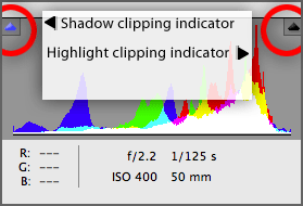 |
 |
 |
|
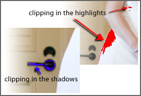
The histogram in ACR also has shadow and highlight clipping indicators (circled in red above). Even without turning them on you can tell if there is any clipping by the color the button shows. Look at the shadow clipping indicator on the left. See how it's shown in blue whereas the indicator on the right (highlights) is dark. Of course, you can also visually see the clipping in the blues to the left. See that small spike of blue getting cut off on the left side? |
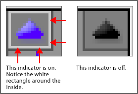
You know your clipping indicators are on if there is a white rectangle along the inside of the box. You'll probably also have some areas of your image covered in bright blue or red pixels. *Many cameras also have this function and will display blinking colors to let you know that there is clipping going on. |
Shadow clipping appears as blue pixels while highlight clipping appears as red pixels. |
The Levels Dialog Histogram And Correcting Contrast With Levels
 |
 |
 |
 |
 |
 |
 |
 |
 |
|
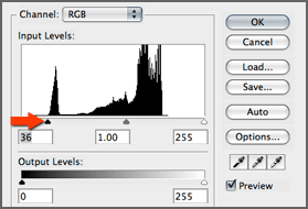
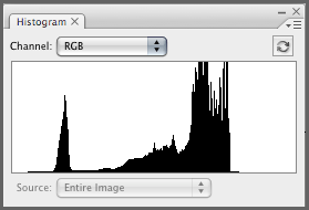
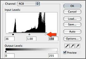
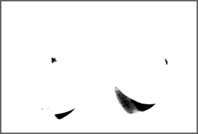
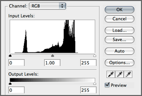
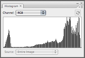
Make sure you have the histogram palette open when you edit your image with levels because the levels histogram (the bottom histogram) won't update with your changes. Note that you can change to the color channels at the top of the Levels dialog. For Now I'm just going to keep it set to RGB so I can adjust the dark and light values and leave the color alone. We can see from these histograms that there is not much contrast in this image. |
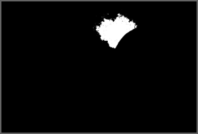
I'll need to set a new black and white point. By holding ALT (Mac Option) and moving the black and white sliders in Levels (top and middle images respectively), you can see a threshold view (pictured to the right of the two levels images) which shows exactly where the shadows and highlights start to clip. By correcting the black and white point I was able to greatly improve the contrast in this image. Notice though, the missing bars in the histogram (directly above). This particular image did not have enough tonal information to accomodate the stretch in tones and is actually missing some tonal imformation now. |
A Closer Look At The Individual Color Channel Histograms
When dealing with color channel histograms, you’re viewing the saturation of that particular color with 0 saturation on the left and 255 (max saturation) on the right. The thing to remember while viewing individual color channel histograms is that at the lower to 0 end of the histogram, you actually have the opposite color. For example: red at 0 saturation is actually cyan. While the actual graph in the histogram does not show cyan, the red values at the far left end are actually cyan in the image.
 |
 |
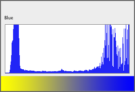 |
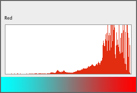
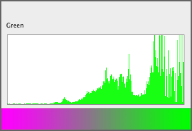
| As you can see from the above diagram, the opposite of red is cyan. So if you have a value that falls in the 0 saturation range on the left of the red channel histogram, you're actually seeing cyan. | With the green channel histogram, 0 saturation is magenta, the opposite of green. | With the blue channel histogram, 0 saturation is yellow, the opposite of blue. |
 |
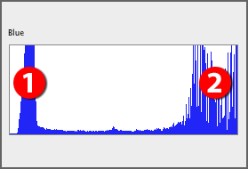 |
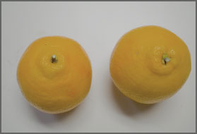
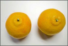
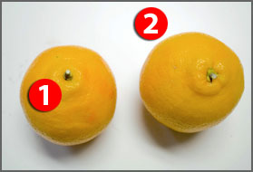
The spike on the left side of the blue color channel histogram, labeled with a red 1, corresponds to the red 1 in the oranges image to the left of the histogram. As you can see, that spike is the yellow values in the oranges. The red 2 represents the lighter blue values in the background. |
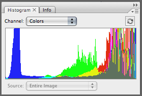 |
 |
|
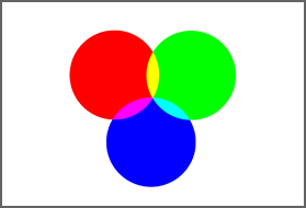
| It's possible to display the histogram with all the color channels overlaying the graph. Note, where the red and blue channels meet you have magenta, where the red and green channels meet you have yellow, and where the blue and green channels meet you have cyan. | A quick study of color light theory. In the color wheel above we can see that the opposite of red is cyan, the opposite of green is magenta, and the opposite of blue is yellow. Where red and green circles meet you have yellow. Where the red and blue circles meet you have magenta. Where the green and blue circles meet you have cyan. |